Aperture
Aperture Case Study – Turning Ads Into an Experience
When I joined Aperture’s product challenge, the story was clear but troubling: younger users—the lifeblood of the platform—were slipping away. They weren’t just skipping ads; they were tuning out entirely. Ad click-through rates among 18–24-year-olds had taken a sharp dive, threatening both revenue and relevance.
Instead of forcing users to endure more ads, I asked a different question: What if we made ads something they’d actually want to tap?
That question led to the Incentivized Ad-Engagement Tool—a playful, “tap to reveal” interaction that trades attention for tangible value: discounts, bonus features, and exclusive filters. With this, ads stopped being an interruption and became part of the experience—restoring engagement while opening a new path to sustainable growth.
Problem Statement
Aperture is struggling to attract and retain younger users due to a lack of innovation and intrusive ad-labeling. Recent analytics show a significant drop in ad click-through rates (CTR) among users aged 18-24, which is a core growth demographic. To remain competitive, we must prioritize innovation and improve ad strategies. If unaddressed, this trend threatens both short-term ad revenue and long-term user base vitality.
Solution
Solution: “The Incentivized Ad-Engagement Tool (IAET)”
Chosen MVP Format:
Single-Feature MVP is the most effective approach.
• By isolating the “Tap to Reveal” ad interaction with reward redemption as a standalone feature, I was able to focus on measuring its core value without interference from other variables.
Functionality to be included in MVP
• Interactive “Tap to reveal” Ad Overlay with pulsing animation and tap cue
• Ad Content Reveal upon interaction, showing full promotional message or offer.
• Immediate Reward feedback (“You’ve unlocked a reward!” message)
• Reward Wallet Access with a simple interface to view and redeem earned items.
• Basic Analytics Tracking: Tap rates, time to interaction, reward redemptions.
My solution with this feature was to make ads optional and rewarding. By offering value like ad discounts, bonus features, or filters we will turn ads into a choice rather than an interruption.
My overall requirements and Key Functionalities will revolve around (Link to full FRD)
• Reward redemption system
• User opt-in/opt-out settings
• Administrative and performance analytics
Hypothesis
Approach
1. User Research & Feedback Analysis - Conduct surveys, interviews, and usability tests with current and former Gen Z and millennial users to identify their needs, frustrations, and ad preferences.
2. Baseline Measurement - Record current ad CTR, user session duration, and churn rates for 18-24 yr olds. This will help establish a clear performance baseline for comparison.
3. Ad Experience Redesign - Shift from intrusive click-bait-style ads to more subtle, personalized, and relevant ad formats with better frequency control to restore user trust and reduce friction.
4. A/B Testing & Iteration - Roll out changes incrementally to segmented user groups, measure key metrics (engagement, session duration, churn rate), and iterate based on real-time data
5. Analyze Results – Compare CTR, session metrics, and feedback across baseline and variations. This will help identify the variations that maximize engagement without eroding trust.
Product Goal
My Goal for this product was to increase engagement and ad-driven revenue among 18–24 year-old users by optimizing ad-labeling and introducing optional interactive ad formats, while maintaining full regulatory transparency and user trust.
What I Wanted to Achieve
• Reposition in-app advertisements from intrusive disruptions into personalized native-feeling, reward based, contextually integrated experiences.
• Provide interactive ad formats (e.g., swipe-to-reveal, rewards, tappable overlays) that encourage youthful exploration and engagement.
• Preserve clear “Sponsored” disclosures to comply with ad regulations and sustain user trust.
Research Methods
I. User Surveys
I gathered quantitative data from current and former users along with our top 3 competitors from over 500 users.
1I. User Interviews
I conducted in depth qualitative interviews with 10 survey participants.
III. Competitor Analysis & Benchmarking
I benchmarked top competing apps to identify differentiating features and engagement strategies. Also analyzed ad implementation strategies w/higher ad revenue performance.


Research Insights
After executing a mixed-method research approach I synthesized the findings to uncover the most relevant patterns affecting Aperture’s younger audience. From a wide range of observations, I prioritized seven key user insights based on their direct impact on engagement, ad interaction, and overall retention potential. These insights became the foundation for shaping our solution strategy.
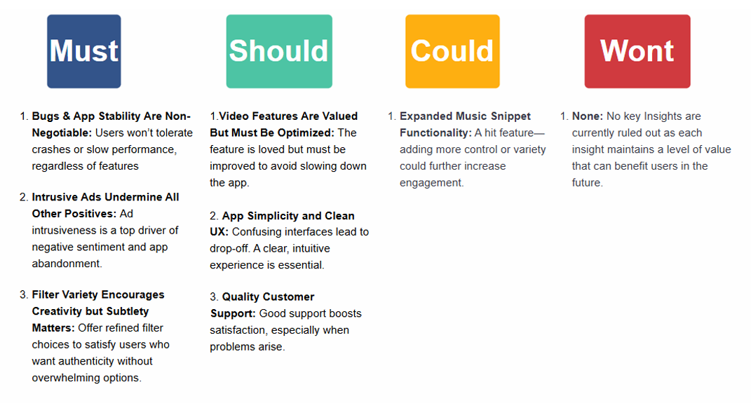
I. Filter Variety Encourages Creativity, But Subtlety matters
Rationale: While users enjoy having filter options, exaggerated or gimmicky filters turn them off. A balanced, tasteful selection supports user expression without feeling inauthentic.
II. Intrusive Ads Undermine All Other Positives
Rationale: No matter how good the features are, excessive or interruptive ads trigger strong negative sentiment and churn.
III. Bugs and App Stability Are Non-Negotiables
Rationale: Even great features can't make up for frequent bugs or crashes. Stability directly impacts user satisfaction.
IV. App Simplicity and Clean UX Boost User Satisfaction
Rationale: Users who find the interface easy to navigate report higher satisfaction. A confusing UI with confusing buttons can result in potential drop-off and poor reviews.
V. Customer Support Quality Enhances Brand Perception
Rationale: Users who’ve had positive support experiences often leave better reviews, showing that even when things go wrong, recovery matters.
VI. Music Snippet Feature Drives Engagement and Sharing
Rationale: This feature makes content creation more expressive, leading to more posts, shares, and time spent in-app. However, the option for autoplay to be on or off must be mandatory as this can provide an unpleasant experience for those who value a more quiet experience.
VII. Video Features Are Valued but Must Be Optimized
Rationale: Users love the new video capabilities, but its resource-heavy implementation causes noticeable slowdowns, hurting the overall experience.
MOSCOW METHOD
To focus on the most impactful opportunities, I applied the MoSCoW prioritization method, categorizing the seven key insights into Must-Haves, Should-Haves, Could-Haves, and Won’t-Haves based on urgency, feasibility, and user impact.
VALUE PROPOSITION CANVAS
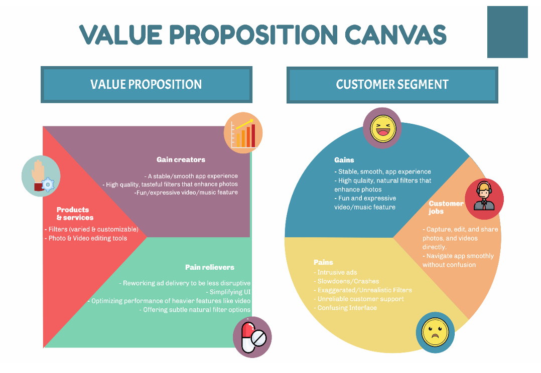
Once prioritized, I used the Value Proposition Canvas to clearly articulate each insight—mapping user pains, gains, and needs to ensure our eventual solution directly addressed the most critical engagement barriers for our target demographic.
IDEATION
After gathering my insights I structured an ideation session and evaluation process conducted by a team of 5 individuals. Beginning with “How Might We” (HMW) questions we focused on three core areas of a photo app’s user experience: intrusive ads, video performance, and exaggerated filters. Through targeted mind mapping, we generated a wide range of innovative ideas and sub-ideas for each issue, fostering deeper exploration of user pain points. These ideas were then filtered and prioritized using a scorecard method, evaluating criteria such as user value, feasibility, and impact on retention. The most promising solutions were further mapped in an effort-impact matrix, helping us balance our ambitions with execution potential. Together, these frameworks provided a clear, data-informed path for moving from insight to action, supporting both strategic planning and creative innovation.
Mind Mapping
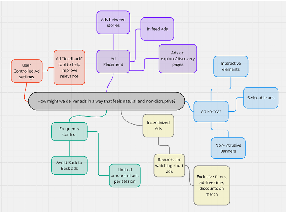
I. Intrusive Ads Undermine All Other Positives
1. How might we deliver ads in a way that feels natural
and non-disruptive to the user experience?
2. How might we personalize ad experiences so they
provide value instead of interruption?
3. How might we offer ad-free or reduced-ad experiences
through meaningful user actions (like engagement, referrals,
or a free model)?
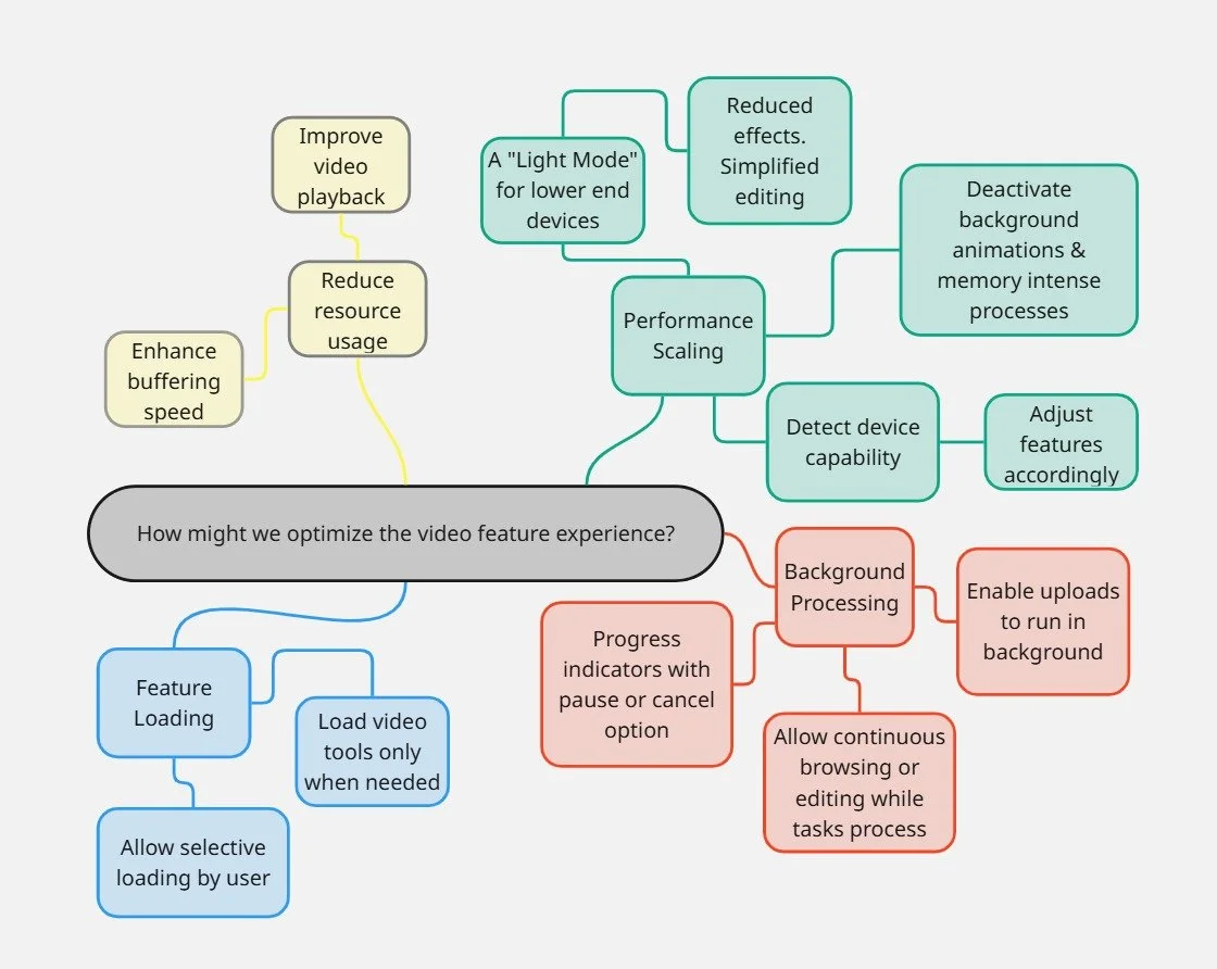
II. Video Features Are Valued but Must Be Optimized
1. How might we optimize video functionality to deliver
a smooth experience without compromising app performance?
2. How might we allow users to enjoy the video feature
based on their device capabilities or preferences?
3. How might we communicate the value of the video
feature while managing expectations around performance?
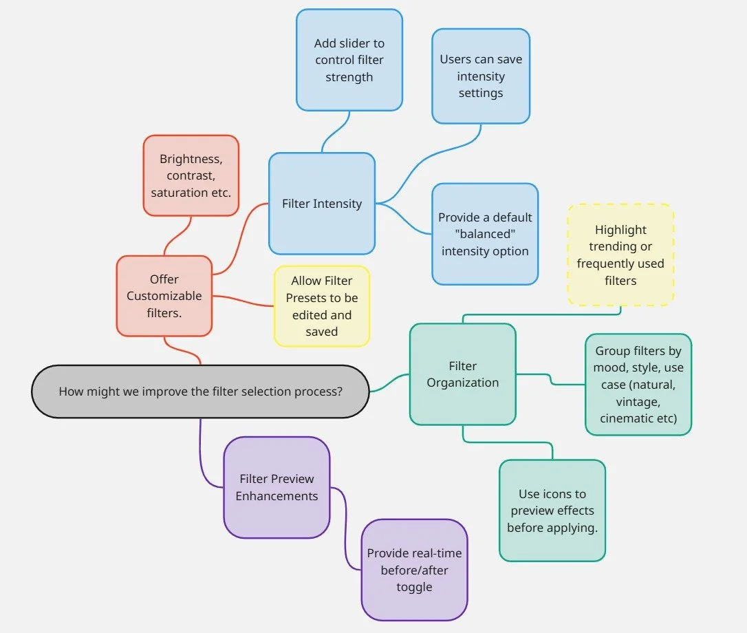
III. Filter Variety Encourages Creativity, But Subtlety matters
1. How might we give users more control over the intensity
and style of filters to suit different preferences?
2. How might we curate and surface the most popular
or tasteful filters based on user feedback and usage data?
3. How might we categorize filters in a way that helps users
quickly find the vibe they’re looking for
(e.g., natural, artistic, cinematic)?
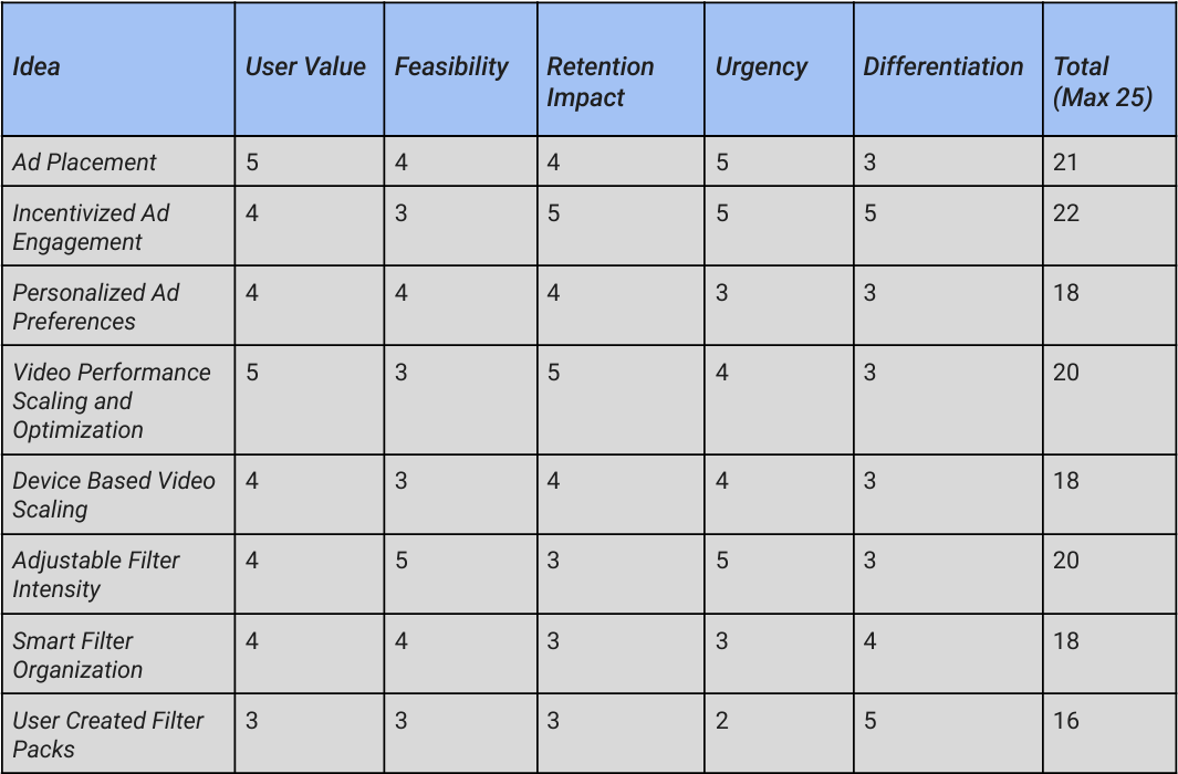
Scorecard Approach
Scorecard Criteria (Rate each idea from 1-5)
1 = Least Important
2 = Less Important
3 = Neutral
4 = More Important
5 = Most Important

Top Priorities Based on Score
1 = Adjustable Filter Intensity = 20
2 = Ad Placement = 21
3 = Video Performance Optimization = 20
4 = Incentivized Ad Engagement = 22
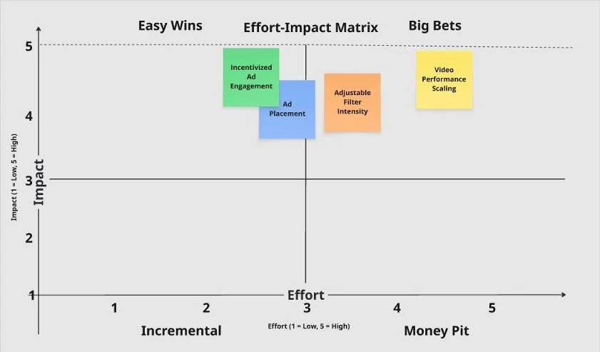
Effort-Impact Matrix
We chose the effort-impact matrix for these specific top-priority features because we felt it would provide us with a clear visual framework for balancing potential value against the resources that may be required to implement them. These specific features were identified as highly impactful based on our feedback and scorecard evaluation, but they vary in complexity. The matrix helps us quickly pinpoint which ideas are quick wins, which deserve strategic investment, and which may need more planning due to higher implementation effort. We believe it will ensure that our roadmap is both user-centered and realistically achievable.
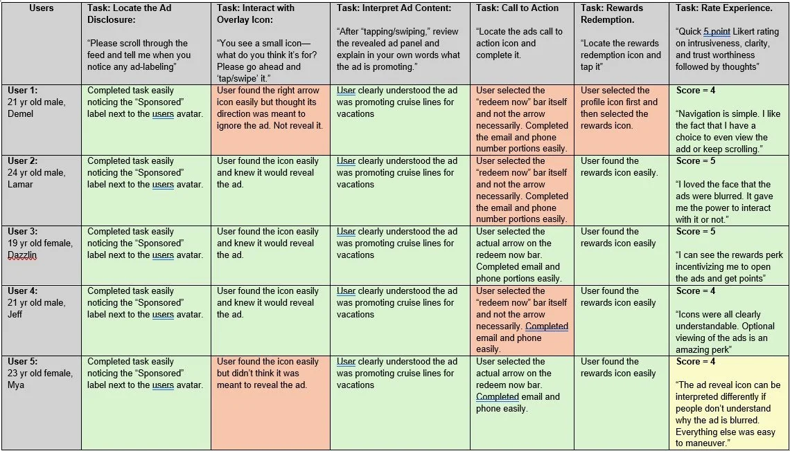
User Testing
With our prioritized insights defined, the next step was to validate and refine the proposed solution through user testing. Our prototype A revealed that the original “swipe to reveal” mechanic created confusion—some users mistook the gesture as a dismissal rather than an invitation to engage. To address this, I designed a new variation and conducted remote 1-on-1 moderated usability sessions with target users (ages 18–24). The goal was to measure clarity, ease of understanding, and engagement potential, ultimately guiding iterations toward the most intuitive and effective MVP design.
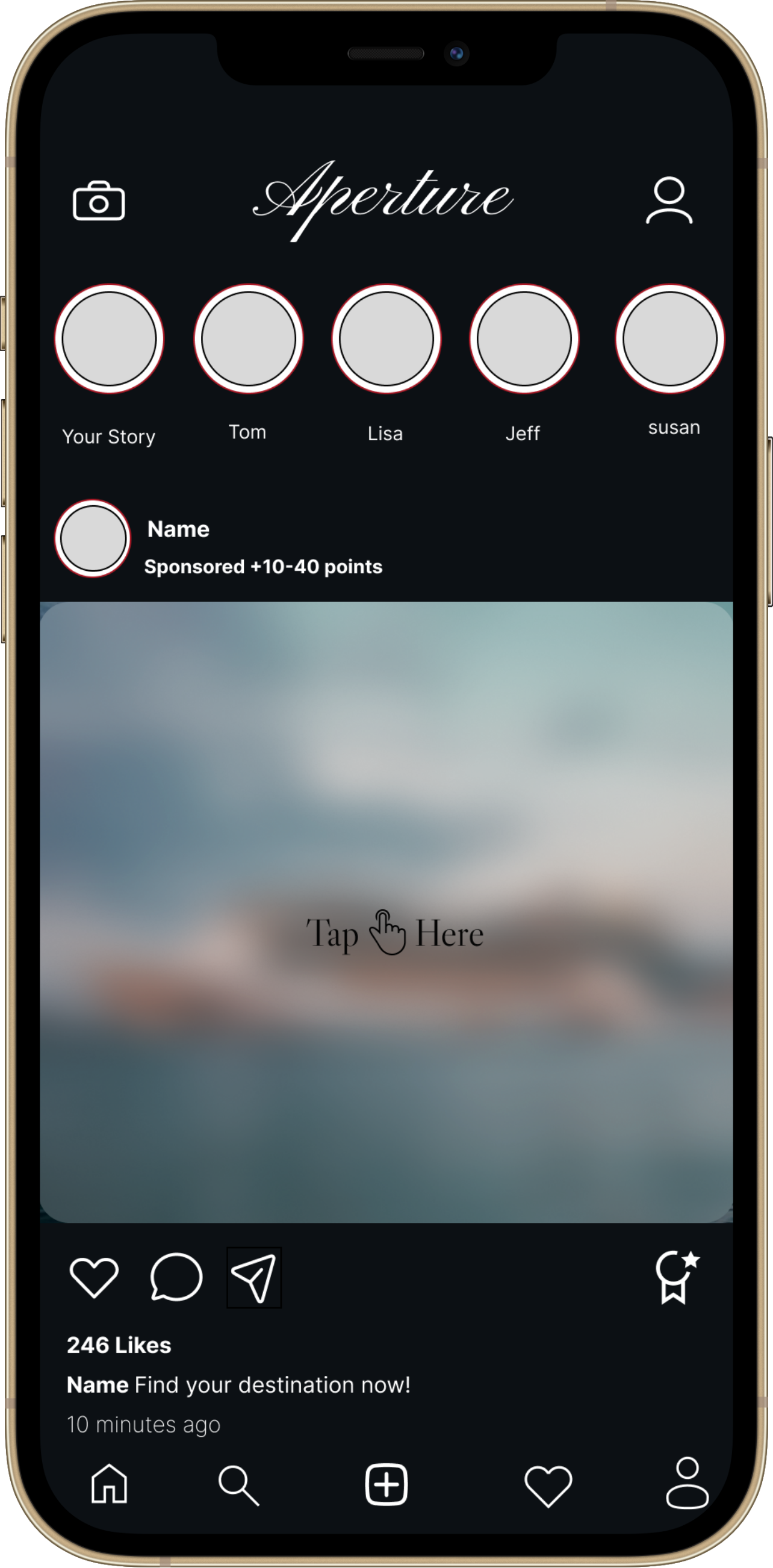
High-Fidelity Wireframes
Overview: I was aiming to test whether a subtler “Sponsored” label, combined with a tap-to-reveal ad and a reward redemption system, improves ad visibility, user engagement, and trust—while ensuring the experience is non-intrusive, easy to discover, understand, and use.
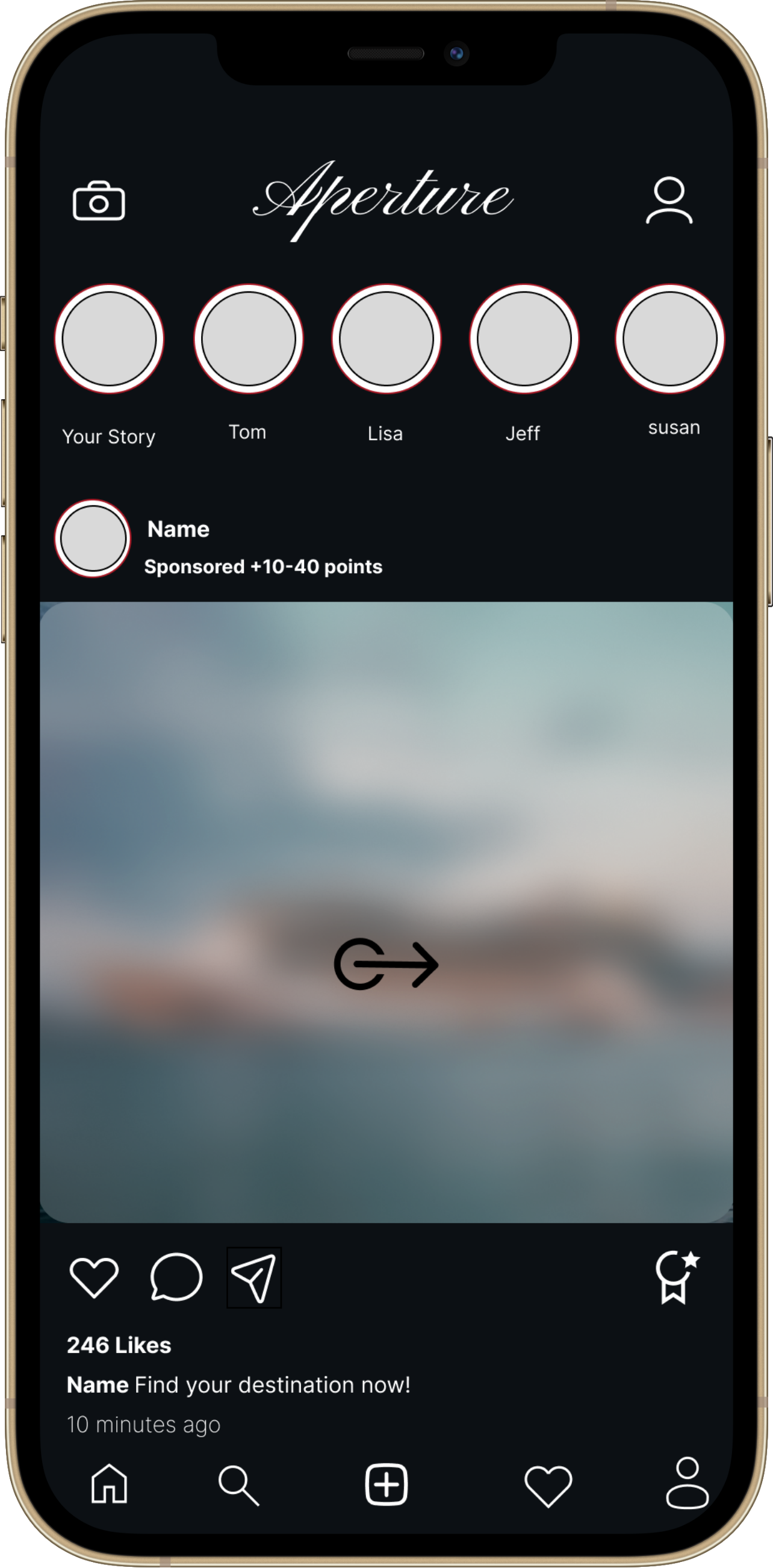
Screen 1: Users must scroll and locate the more subtle “sponsored” label signifying an ad.

Screen 2: After locating the ad, users must tap and swipe the icon to the right revealing the ads contents.


Screen 3: Once users reveal an ads contents they can choose to claim their rewards points by following the ads “call to action” after they tap the redeem now bar.
Screen 4: Once the user completes the call to action their rewards icon will change colors reflecting a redeemable reward is now available.
Analysis of Results:
1. High Visibility
All users immediately noticed the semi-transparent overlay with pulsing animation, which visually stood out without being disruptive.
2. Clear Interaction Purpose
The “Tap Here” text combined with subtle motion cues successfully conveyed interactivity.
Users intuitively understood the purpose of tapping the ad element icon without needing guidance or explanation.
3. Fast & Smooth Completion
Users tapped and completed the interaction within 3–5 seconds on average.
No confusion was observed during the flow, and all users were able to access the full ad content easily.
4. Reward Connection
Users successfully associated their action (tapping the ad icon) with revealing the ad and earning a reward, thanks to immediate feedback (e.g., “Redeem Now” message).
They viewed the experience as “low effort” with “instant benefit.”
Launch Plan
With the MVP validated through testing and iteration, the next step was to design a clear Launch Plan that ensured both cross-team alignment and market readiness. The plan was structured into four distinct phases—Planning & Strategy, Build & Validation, Go-to-Market Preparation, and Launch & Post-Launch Optimization—each with specific goals, timelines, and ownership. This phased approach provided a roadmap to move from concept to release while reducing risk and maximizing impact at launch.
90 Day Launch Plan
-
Launch Kick-Off + Scope Alignment
-
Prototype testing begins
-
MVP Build Complete
-
QA + Stakeholder sign-off
-
GTM assets finalized
-
Soft Launch + Feedback Review
-
Public Launch
-
KPI Evaluation + Optimizations
-
Post-Launch Review + Roadmap Planning
What Did I Learn?

The Aperture project was a powerful reminder of the
importance of user-centric problem solving and the discipline required to turn a complex challenge into a focused, actionable solution. Here are the biggest takeaways from the journey:
Framing the Problem Clearly Sets the Direction
Starting with a precise problem statement helped keep the entire process aligned. By defining that Aperture’s core challenge was retaining and engaging younger users while improving ad performance, I was able to focus research, ideation, and design decisions around solving the right issue rather than chasing distractions.Research Provides the “Why” Behind the Data
Using surveys, interviews, and competitor benchmarking allowed me to go beyond surface-level analytics. While the numbers showed declining CTR, it was the user feedback that revealed why—ads felt intrusive and uninteresting. This human layer of insight turned data points into actionable opportunities.
3. Prioritization is Crucial for Focus
With seven key insights gathered, I used the MoSCoW method to separate what was essential from what was nice-to-have. The Value Proposition Canvas then helped articulate those insights into user pains and gains, ensuring that the eventual solution addressed the most critical engagement barriers for the 18–24 demographic.
4. Iteration is the Heart of Innovation
The original “swipe to reveal” interaction tested poorly, but instead of discarding the concept, I iterated. Prototypes A and B tested different cues (“swipe right” vs. “tap here”), and usability sessions revealed which path better resonated with users. This reinforced that testing isn’t just about validation—it’s about discovery.
5. Simplicity Can Be Transformative
The Incentivized Ad-Engagement Tool wasn’t a complicated feature set; it was a single, clear MVP with a simple mechanic: tap to reveal and earn rewards. Yet this small change had the potential to reframe ads from a source of annoyance to a value-driven interaction. It proved that impactful innovation doesn’t always mean adding more—it often means designing smarter.
6. A Structured Launch Plan Drives Confidence
Breaking the release into four phases—Planning & Strategy, Build & Validation, Go-to-Market Preparation, and Launch & Post-Launch Optimization—ensured that each team would be aligned on goals and timelines. This phased roadmap reduced risk, made the process transparent, and set Aperture up for both immediate and long-term success.
7. The User Always Comes First
At every step, I was reminded that the success of a product hinges on its users. By making ads optional, rewarding, and fun, Aperture wasn’t just protecting ad revenue—it was re-earning the trust and engagement of its most important audience.
Final Reflection
Through this journey, I learned that the best product decisions come from balancing business needs with user needs, and that innovation often means reframing an old problem in a new way. The Aperture case study strengthened my ability to connect insights, strategy, and execution into a cohesive story—one that turns challenges into opportunities for growth.